A national health insurer identified a group of customers aging into Medicare who needed to know their upcoming deadlines and find the right plan. Our team designed responsive pages and widgets to do both.
My role
UI Designer, working with a UX designer and a creative director
Agency
Deloitte Digital
What I designed
An eligibility landing page, a three-step plan finder, and the plan recommendation it produces
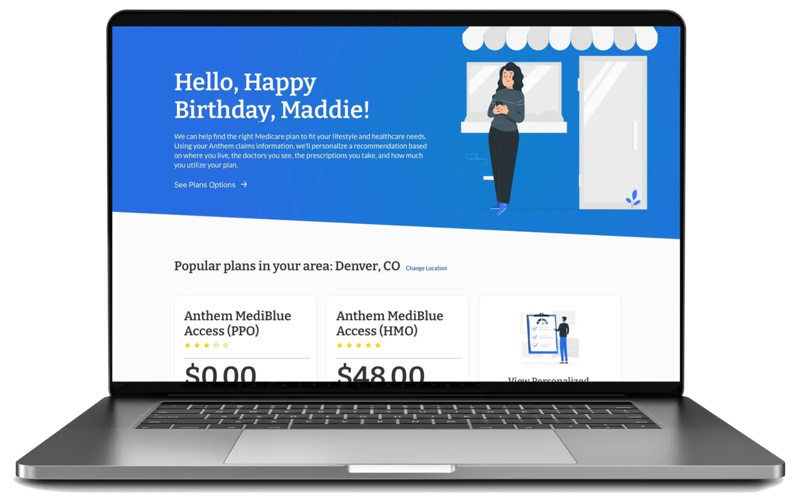
The landing page paired with an email campaign. It greets the customer by name and shows popular plans where they live.
Designing for people new to Medicare
The landing page launched alongside an email campaign telling customers they were becoming eligible. With an older audience in mind, we designed it for accessibility within the client's brand colors and type, and used illustration and location to make it personal.
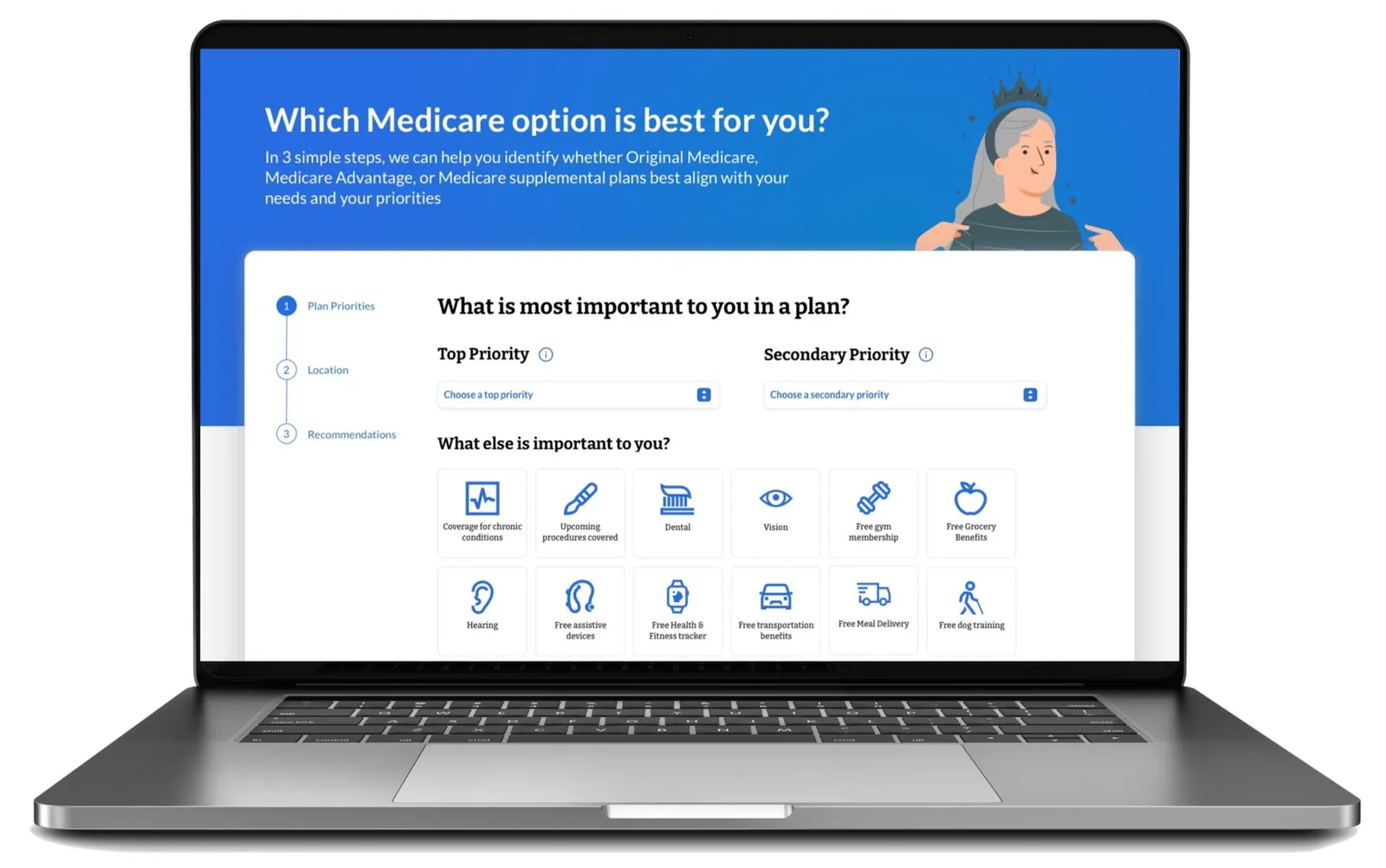
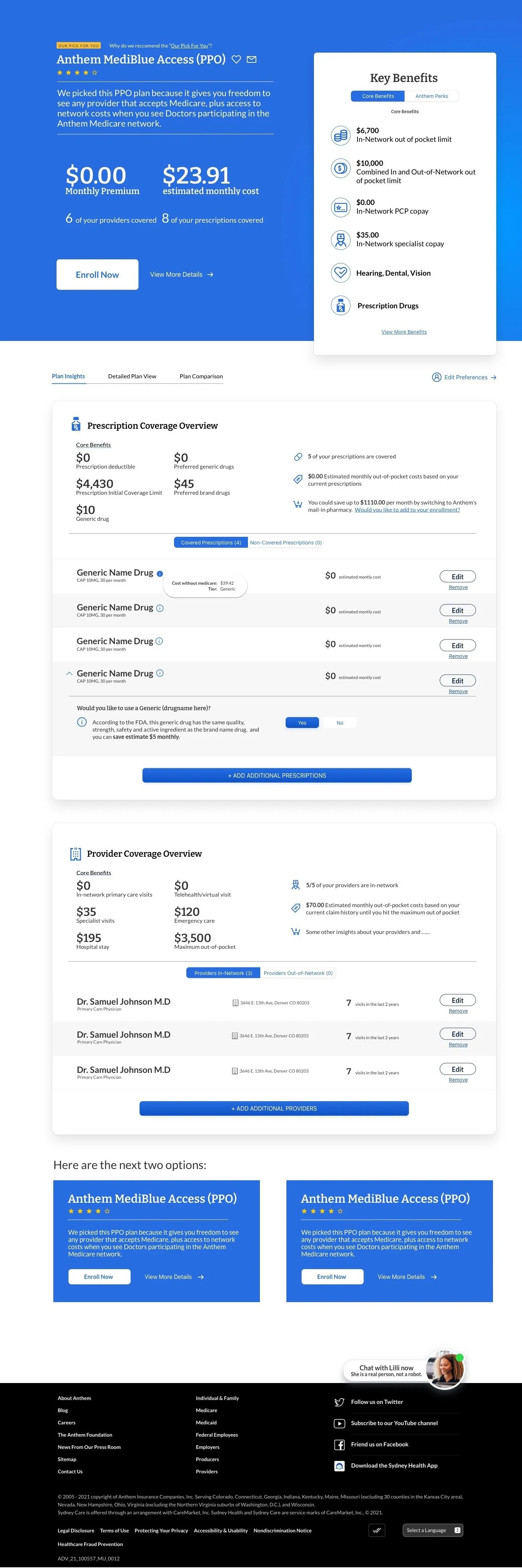
The plan finder narrows the choice in three steps. The recommendation that follows shows prescription and provider coverage, core benefits and perks, plus alternatives for comparison.
Step two of the plan finder: what matters most to you in a plan.
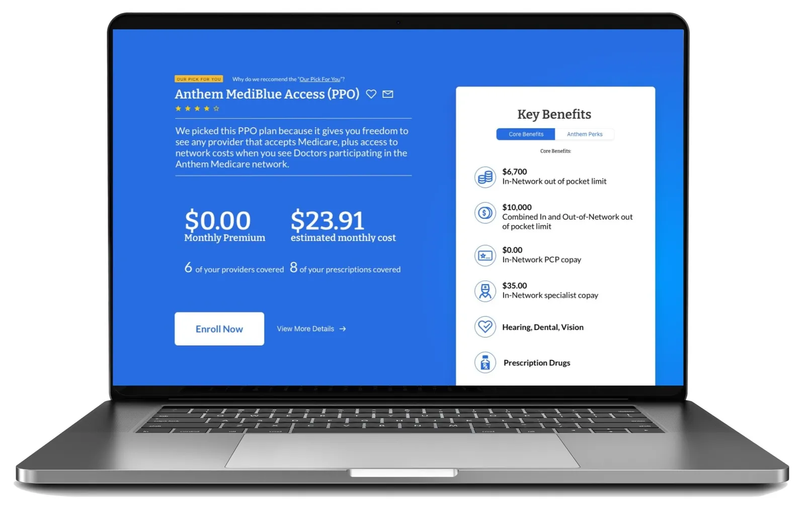
The recommendation, with costs and key benefits up front.
The full flow. Scroll inside the frame to see it end to end.